How to Use Elementor Template Library
One of the great and most useful features of Elementor is the Elementor Template Library.
This library includes many pre-designed full-page and section templates that help you to get started with your first project.
Elementor not only gives us the flexibility of importing and exporting templates, but they also make it easy to reuse and save the same template for many projects.
This section will explain everything about Elementor templates, from using Elementor free templates to the Import/Export feature.
Using Elementor Free Templates
- To access Elementor templates, Click the icon 📁 in the Elementor editor.
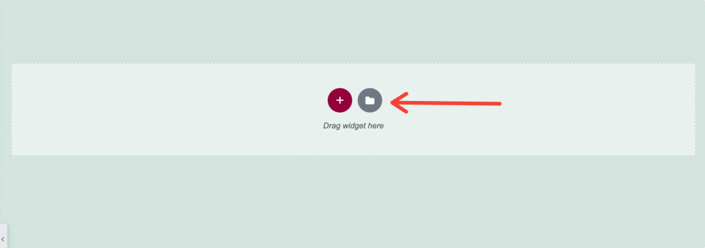
- After clicking the icon, a new window appears with the Blocks, Pages, and My Templates tabs.
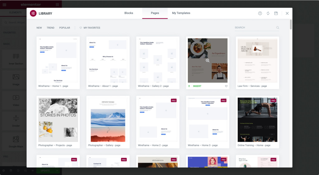
- Blocks are the Section Templates, Pages are the Full-Page Templates, and My Templates are the templates saved by the user.
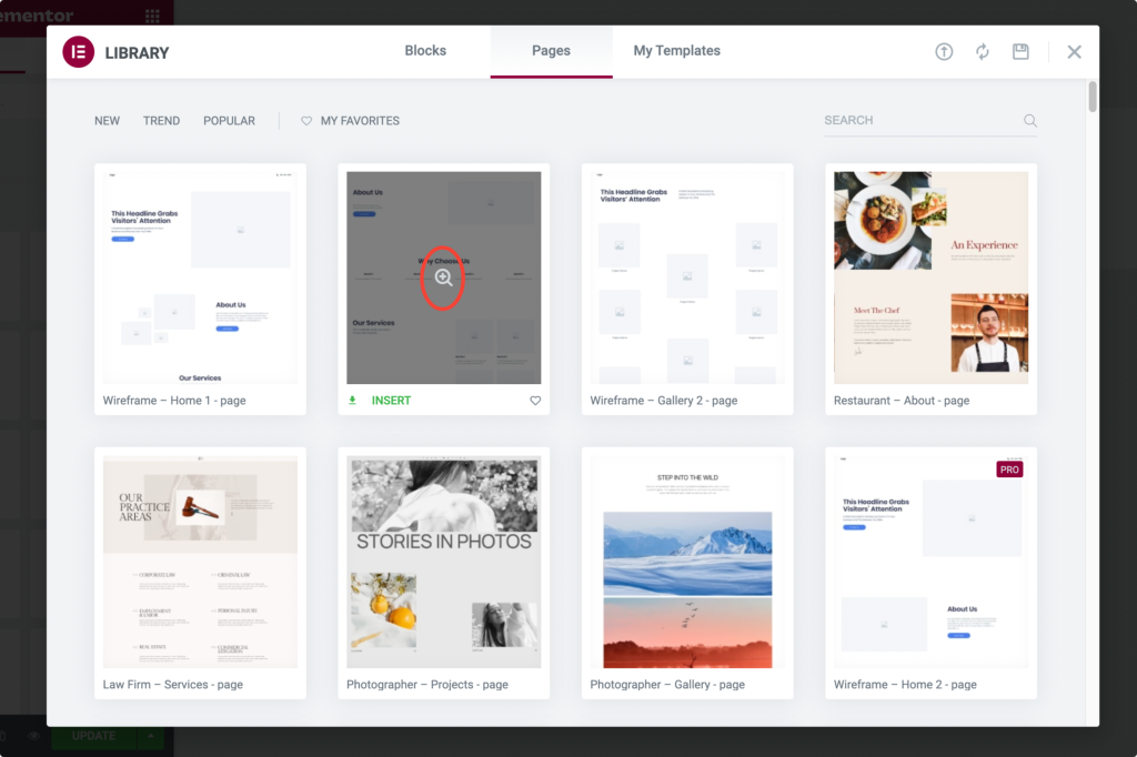
- Click the magnifying glass icon to preview a template.
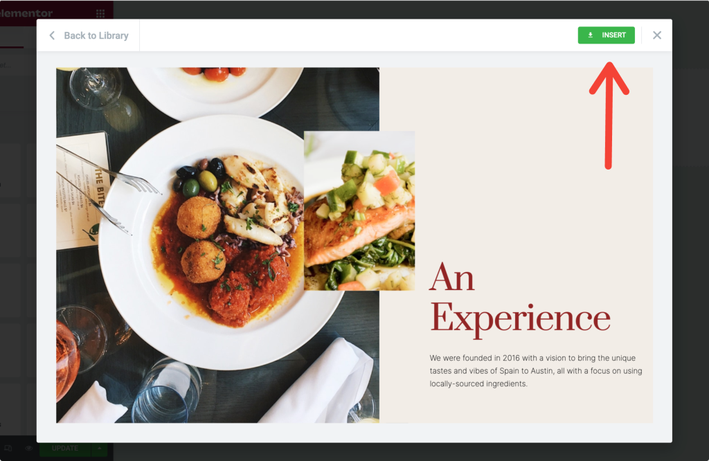
- Click Insert to add the chosen template.
If you are first time using Elementor, using templates from the template library requires you to complete a 2-step signup process.
Once you complete the process, the template is automatically fetched to your web page.
Save a Section as a Template in Elementor
Including the functionality, if saving a whole page as a template, Elementor gives us the flexibility to save a single section as a template.
Let’s say you have built a contact section on your page and want precisely the same section on every page of your website.
Instead of designing that contact section on every page, you can simply save it as a template and use it on every website page.
Let’s see how you can save a section as a template:
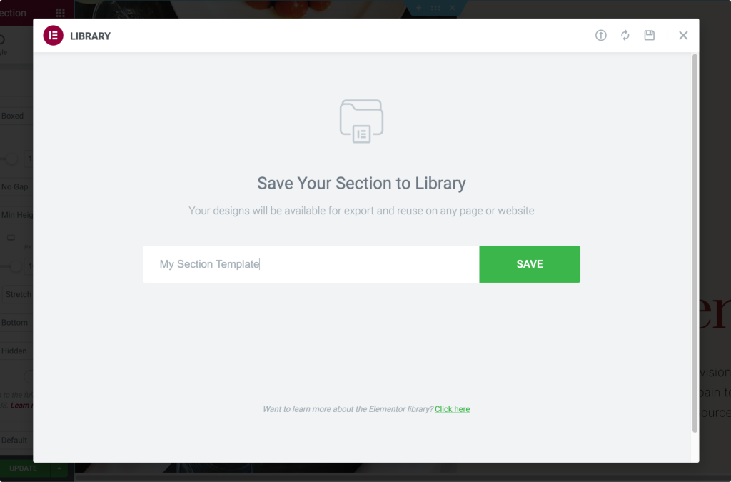
- To save a section as a template, choose the section you want to save and right-click on the Edit Section.
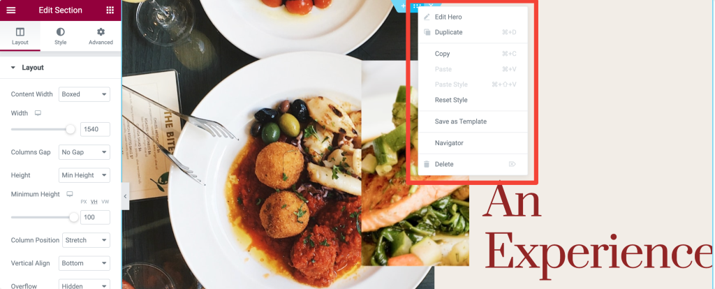
- After clicking the section, a menu appears with a few options; choose the Save as Template option. Give your template a proper name and save it.
Save a Page as a Template in Elementor
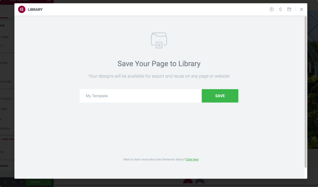
- First, open the page with the Elementor Editor. Click on the Up Arrow icon in the bottom left of the page and select the “Save as Template” option.
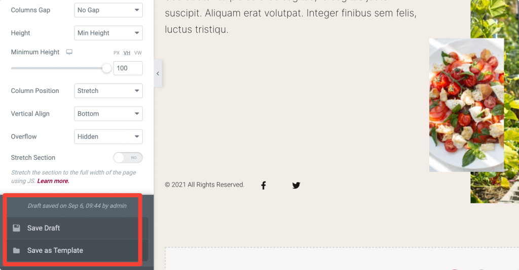
- After clicking the option, a new window appears; give a name to your template and save.
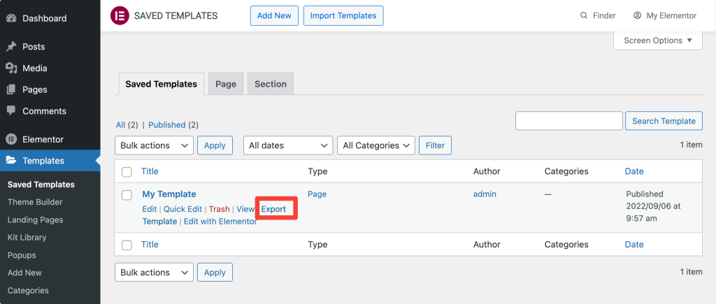
Export Elementor Templates
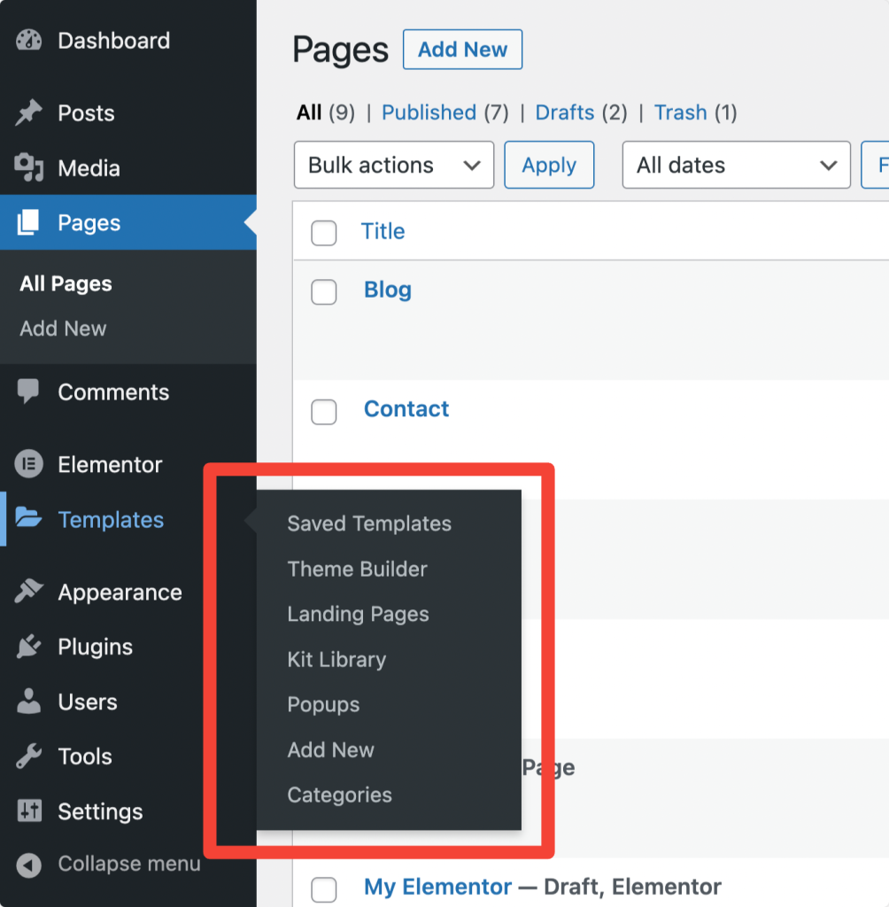
- You can export templates from the WordPress dashboard. For exporting templates, open WordPress dashboard>>Templates>>Saved Template.

- Choose the template and click the “Export Template” option.
- You can also export a template from the Elementor library. Open the Elementor library & click on the My template tab. Under My Templates, click the 3-dots at the right and click Export.
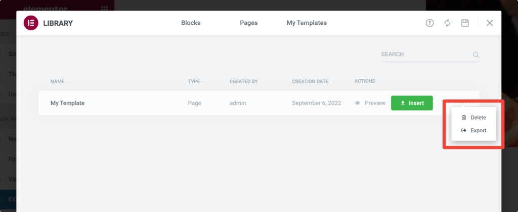
In both methods, your template file will be saved in JSON format.
Import Elementor Templates
- To import an Elementor template, first, open your WordPress Dashboard>>Templates>>Saved Templates.
- At the top of the page, select the option Import Templates.
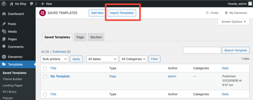
- Upload the JSON format file & click on the Import Now button.
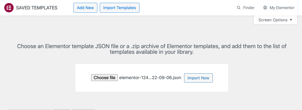
Once you import the file, you can see it in your template list & can be used in any layout.
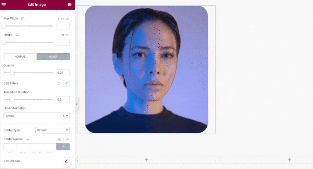
How to Add Image Hover Effects in Elementor
Elementor offers the flexibility to add hover effects to any Widget, Column, and Section.
To add the hover effect to any image on your page, drag and drop the Image widget and go to the Style Tab.
In the Style Tab, under the Image subsection, you’ll see the Normal and Hover buttons.
Click the Hover button, and you’ll find multiple options to add hover effects.
You can:
- adjust hover effect opacity.
- set transition duration.
- and choose from the multiple effect types.
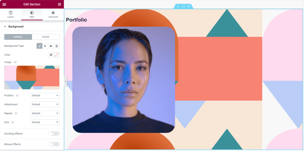
How to Change Background Image in Elementor
- Open the Elementor Section Settings.
- Go to Style and choose Background > Background Type > Classic.
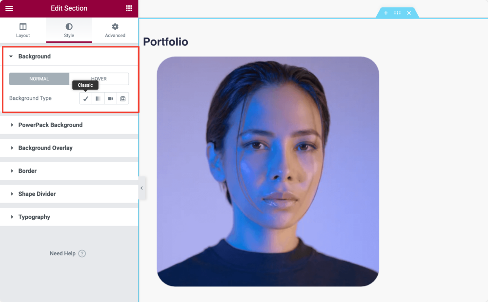
- Under the Image subsection, click the + sign and add your image.
Advanced Tab of Elementor Section
In the Advanced tab, you find options to define advanced settings such as margin., padding, motion effects, etc.
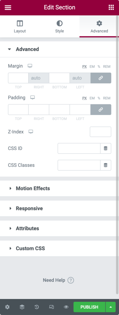
- Advanced Options
- Margin: From here, you can set the margin for your section.
- Padding: Set the padding for the section.
- Z-Index: Z-Index helps you to specify the stack order of elements on your page.
- CSS ID: Define CSS ID for your section.
- CSS Classes: Add CSS Classes for your section.
- Motion Effects: Add motion effects to your page elements.
- Responsive Options
- Reverse Columns: Enable this option to reverse the order of your columns on both Tablet and Mobile.
- Visibility: Show or Hide section on Desktop, Tablet, or Mobile.
- Attributes: This option lets you add custom attributes to any element. But this feature is not available with the Elementor free version.
- Custom CSS: From here, you can add any custom CSS to any widget, but this is also not available with the free version.
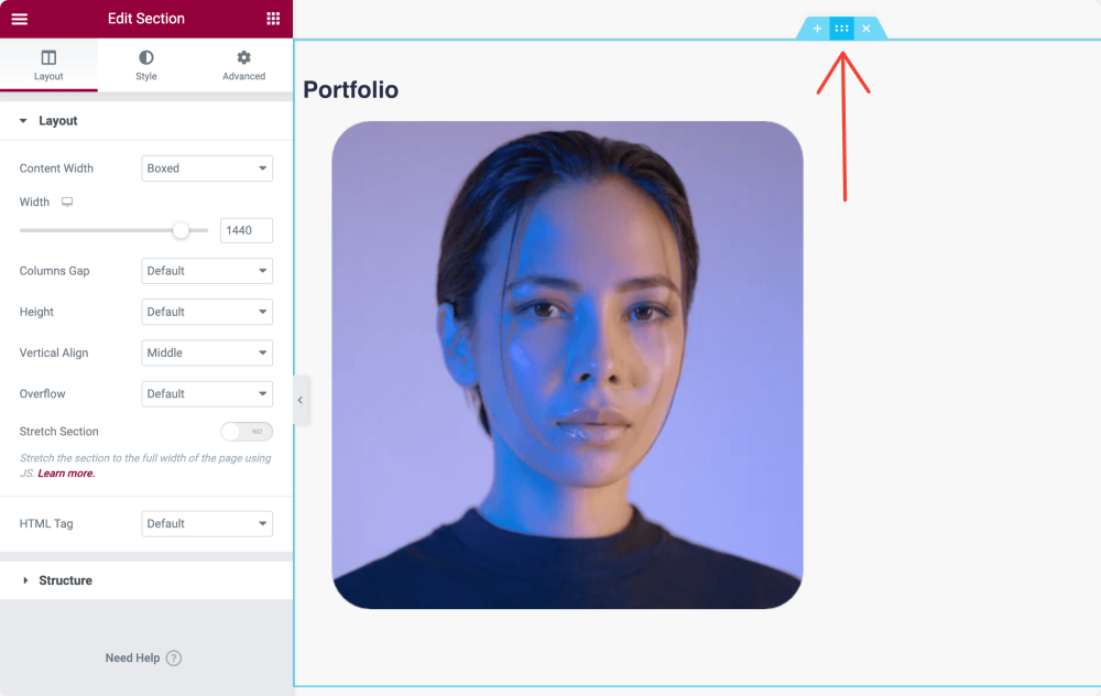
Column Overview
Like sections, columns also consist of three tabs: Layout, Style, and Advanced.
Layout Tab of Elementor Column
- Layout Options
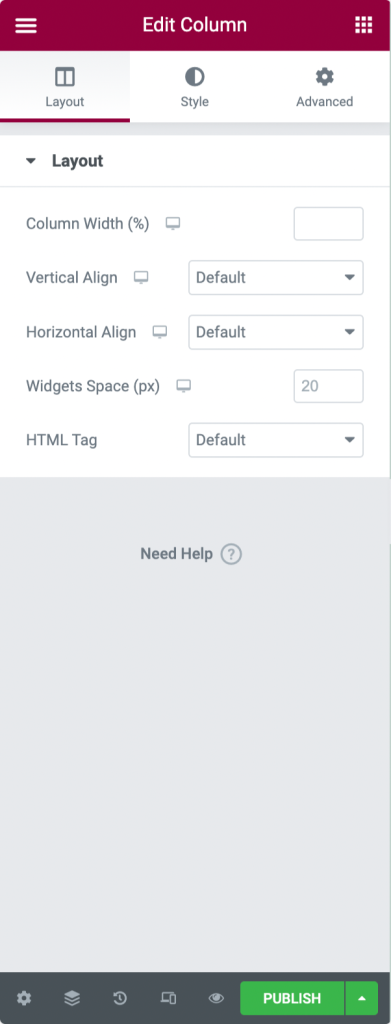
- Column Width: Use this option to define your column width.
- Vertical Align: You can set your column content’s vertical alignment here.
- Horizontal Align: This option allows you to align the inline widgets in the same row horizontally.
- Widgets Space: Adjust the space between inline widgets.
- HTML Tag: Set an HTML Tag for your column.
Style Tab of Elementor Column
- Style Options
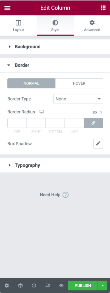
- Background: Choose between Classic, Gradient, or Slideshow backgrounds.
- Border: Set your Border Type, define Border Radius, and add Box Shadow.
- Typography: Set Typography Colors for the column.
Advanced Tab of Elementor Column
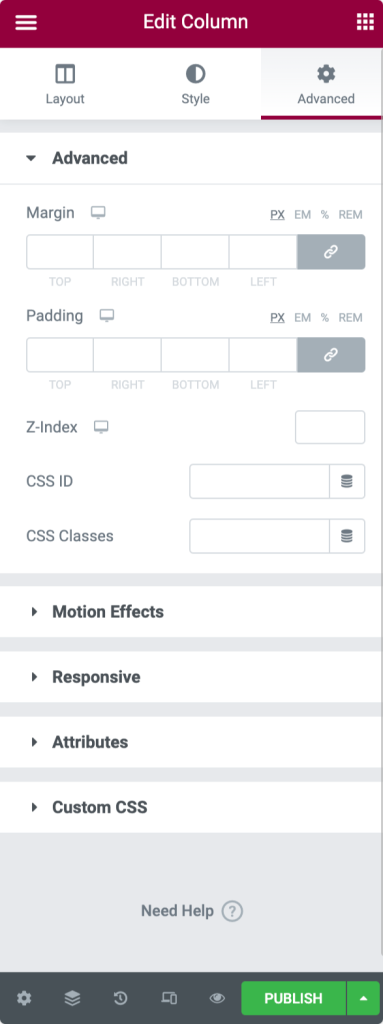
- Advanced Options
- Margin: From here, you can set the margin for your column.
- Padding: Set the padding for the column.
- Z-Index: Z-Index helps you to specify the stack order of elements on your page.
- Motion Effects: Choose an animation from the drop-down menu.
- Responsive Options: Show or Hide column on Desktop, Tablet, or Mobile.
- Attributes: Add custom attributes to any element. But this feature is not available with the Elementor Free version.
- Custom CSS: Add any custom CSS to any widget, but this is not available with the free version.
Style Tab of Elementor Section
Style Tab is the second tab of your section. From here, you can customize multiple styling options as per your preferences.
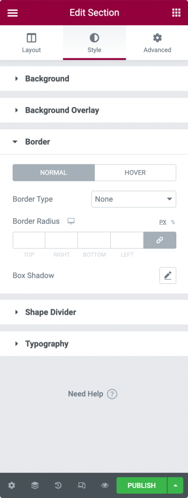
- Style Options
- Background: Select between Classic, Gradient, Video, or Slideshow backgrounds.
- Background Overlay: Choose between Classic or Gradient.
- Border: From here, you can set your Border Type, define Border Radius, and add Box Shadow.
- Shape Divider: Choose shape divider style, color, width, height, etc.
- Typography: Set Typography Colors for the section.
Content Tab of Elementor Widget
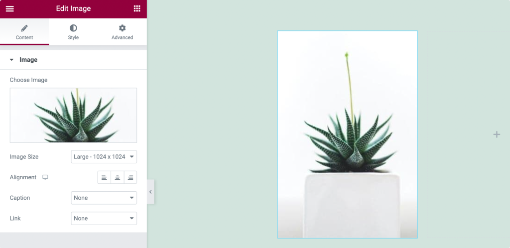
Content tab allows you to set the content of your widget. The content could be in any form, either text, image, or video.
So, for the Image Widget, the Image works as content. You can add any image of your choice, set its size, define its alignment, and add a caption from the content tab.
Style tab of Elementor Widget
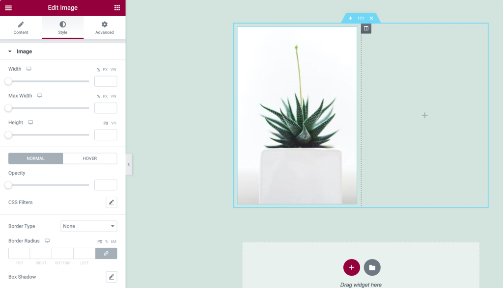
Style tab is the tab where you design, customize, and add styles to your widget. Again styling properties are different for every widget.
For the Image Widget, you can set Image width and height. Add border and border radius. Also, to make it more attractive, you can box-shadow it.
Advanced Tab of Elementor Widget
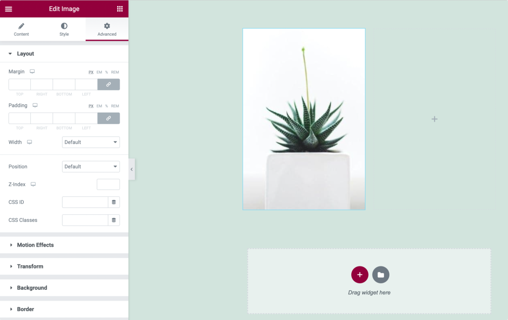
You can add Margin and Padding to your widget from the advanced tab. You can add motion effects and background, define positioning, and make your widget responsive for all device types.
I hope you have completely understood the Sections’, Columns,’ and Widgets’ settings & properties.
We are moving to our next step, i.e., Building a Page with Elementor.